Education · Education
University Transparency Return

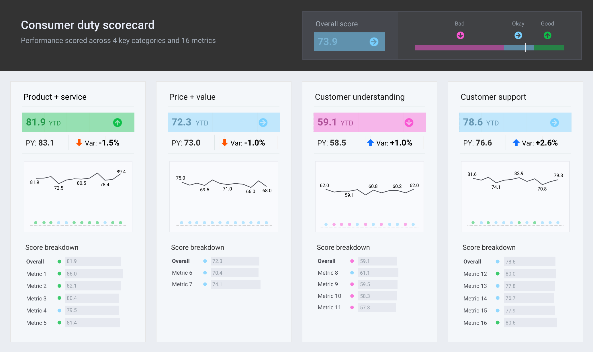
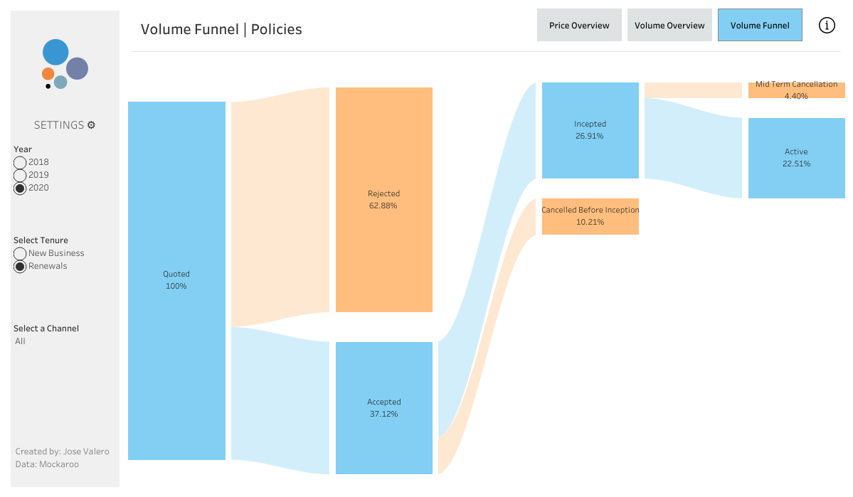
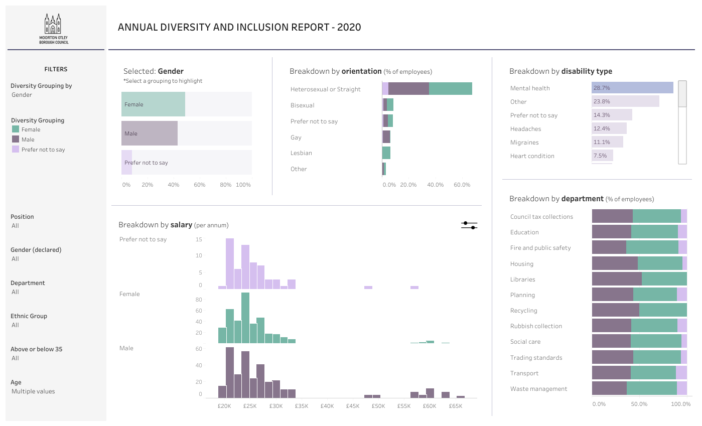
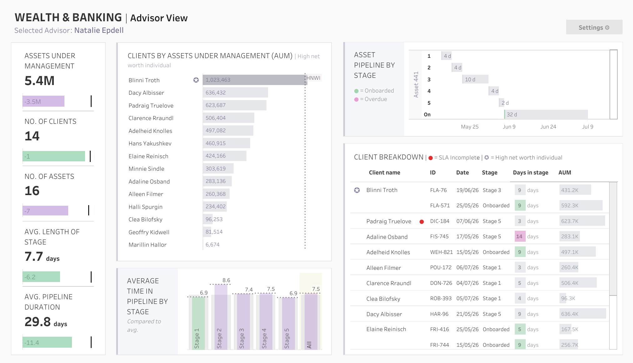
These four dashboards illustrate how transparency reporting can be visualized in higher education. They display application, offer, and acceptance data in clear tables by ethnicity and gender, while also offering interactive views by applicant, region, and subject. University administrators and admissions officers can use these insights to ensure fair admissions practices, improve diversity, and meet compliance and reporting obligations.
Questions this dashboard answers
- How do the university's application, offer, and acceptance rates compare across different racial groups?
- How many applications were submitted in the UK alone?
- How do application numbers, offers, and acceptance rates vary across the Index of Multiple Deprivation Quintiles (IMD) shown?
At a glance
Built withTableau
SectorEducation
Views71
Published2026
educationtransparency
Powered by Tableau
Questions this dashboard answers
- How do the university's application, offer, and acceptance rates compare across different racial groups?
- How many applications were submitted in the UK alone?
- How do application numbers, offers, and acceptance rates vary across the Index of Multiple Deprivation Quintiles (IMD) shown?
At a glance
Built withTableau
SectorEducation
Views71
Published2026
educationtransparency